


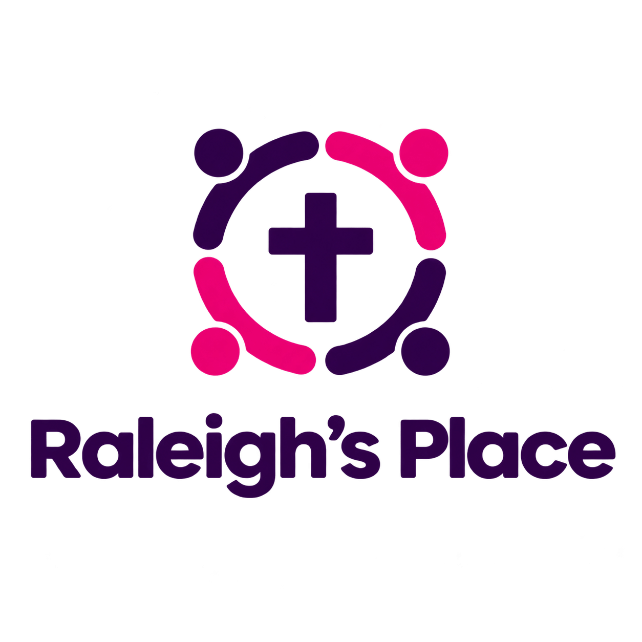
Raleigh’s Place has a new look.
After many years with our previous logo, we felt it was time to update our visual identity to better reflect who we are today while preserving the heart of what has always defined this ministry.
Our former logo communicated something important: the cross of Christ at the center, surrounded by people in community. We did not want to lose that.
Instead, our new logo simplifies and strengthens that same idea.
The cross remains at the center because our Christian faith remains at the center of everything we do. Around it are four people, representing the community of support Raleigh’s Place seeks to build around children and families navigating foster care.
Those four figures also connect naturally with the four pillars that now help define our ministry:
- Strengthen the Family — Partner Homes
- Encourage the Child — Camp 1:27
- Equip the Young Adult — Workmanship Initiative
- Engage the Community — Katie’s Kloset
The updated logo is cleaner, easier to recognize, and more flexible for use across our website, printed materials, apparel, signage, and other communications. But this change is about much more than simply giving Raleigh’s Place a new look.
Our mission has not changed.
Raleigh’s Place surrounds children and families navigating foster care with Christ-centered support from childhood into adulthood.
Whether we are supporting foster families, encouraging children at camp, equipping young adults transitioning from foster care, or engaging our community through Katie’s Kloset, we remain committed to the same calling that has guided Raleigh’s Place from the beginning:
Living the Gospel by Loving the Fatherless.
So while you may begin seeing a new logo on our website, social media, signs, shirts, and ministry materials, the heart behind it remains the same.
New logo. Same mission. Same commitment to children and families.
